I'm not sure if I could work up enough hate over them now for it to be any motivation, but if I'm going to beat on the thing, it might as well be named after someone I have no use for. I really look forward to putting together a soundtrack. Peaches! Ice-T! Holly Golightly!

Spike: Ladies. Come on in. Plenty of blood in the fridge, don't be shy. Dawn: You mean like, real blood? Spike: What do you think? Dawn: Mostly I think, 'Eew!'
'Potential'
Natter Area 51: The Truthiness Is in Here
Off-topic discussion. Wanna talk about corsets, duct tape, or physics? This is the place. Detailed discussion of any current-season TV must be whitefonted.
Daisy Jane - May 08, 2007 7:36:32 am PDT #6019 of 10001
"This bar smells like kerosene and stripper tears."
DavidS - May 08, 2007 7:37:59 am PDT #6020 of 10001
"Look, son, if it's good enough for Shirley Bassey, it's good enough for you."
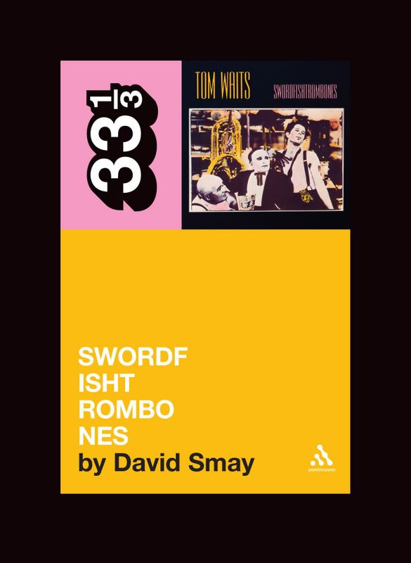
Book cover redesigned per our suggestions (the designer agrees with me/us)
How does it look? Okay or completely wrong? I mean if you looked at it and didn't know there had been an issue with getting it to fit on the cover would it bug you? Or would you get it?
Daisy Jane - May 08, 2007 7:40:25 am PDT #6021 of 10001
"This bar smells like kerosene and stripper tears."
If I were familiar with the album and the series? Probably.
Jesse - May 08, 2007 7:41:43 am PDT #6022 of 10001
Sometimes I trip on how happy we could be.
Not being familiar with the album, that cover would tell me there's something weird going on there. Which is the point, right?
I cannot believe how bad my allergies are today! I don't usually have allergies, so it's always a shock. Stupid beautiful lilacs everywhere.
sumi - May 08, 2007 7:41:59 am PDT #6023 of 10001
Art Crawl!!!
I think that even if you didn't know about the series -- if you knew about the album, you'd get it. I also think that the audience is probably people who know about the album.
§ ita § - May 08, 2007 7:42:19 am PDT #6024 of 10001
Well not canonically, no, but this is transformative fiction.
Since I don't know the album, I wouldn't get it. But I would wonder why that's the title of the book. In a better way than if it had been broken along word lines.
Facebook is kicking my ass! The strangest people have found me (McGill improv member I haven't seen since '93, guy who wrote/directed the crappy $0 budget action flick I was part of for a hot second....). Mostly I don't mind, and I have been traversing memory lane. I guess Robin's mention of it was more than timely.
tommyrot - May 08, 2007 7:42:38 am PDT #6025 of 10001
Sir, it's not an offence to let your cat eat your bacon. Okay? And we don't arrest cats, I'm very sorry.
How does it look?
I say it looks good. Probably the best one can do in a tricky situation like this. And I think it would work OK for the unfamiliar....
DavidS - May 08, 2007 7:43:50 am PDT #6026 of 10001
"Look, son, if it's good enough for Shirley Bassey, it's good enough for you."
Not being familiar with the album, that cover would tell me there's something weird going on there. Which is the point, right?
Kind of. I think it helps that the album title and cover are right up there in the right hand corner.
Also I think your eye can kind of look at all the letters involved and see that they wouldn't fit without being broken, and then maybe (if you know the album) the logic of not breaking it on the composite words would become clear. I hope so anyway.
Liese S. - May 08, 2007 7:44:06 am PDT #6027 of 10001
"Faded like the lilac, he thought."
Yeah. It's fine.
Grump.
But really, it's fine. It looks good.
sarameg - May 08, 2007 7:44:55 am PDT #6028 of 10001
Not really knowing much about the series or origins of the title, it's a tad bit confusing to me. However, I am also a person who apparently sometimes forgets that english is her first and native language and will deciphers a sign or billboard phonetically (and usually incorrectly) because of unusual font or spacing. So, my opinion may be suspect.